Create Charts From Data With OurAI Chart Generator
How to Turn CSV or Excel Data Into a Chart
Add Your Data Source
Define the Question and Scope
Generate and Refine the Chart
Verify and Export
From Raw Data to Presentation-Ready Charts
Work From Files, Not Placeholder Numbers
Upload CSV or XLSX data, or reference a table or finding inside a PDF, DOCX, or PPTX. Tell Mew which source matters so the chart brief starts with your content instead of invented data.
Choose a Chart That Fits the Question
Compare categories with the AI Bar Graph Generator, show change over time with the AI Line Graph Generator, or explain a simple share with the AI Pie Chart Generator.
Design for Reports, Slides, and Research
Request a 16:9 executive slide, a clean research figure, a report-ready graphic, or a classroom visual. The chart can include a takeaway title, annotations, direct labels, units, and a visible source note.
Refine the Visual Through Chat
Use Chat Edit to change the chart type, reorder categories, rename axes, reduce visual noise, move the legend, or highlight one meaningful series without rebuilding the design from scratch.
Apply Brand and Accessibility Cues
Upload a logo or visual reference and name your colors, type direction, and layout. Ask for strong contrast, direct labels, restrained color, or patterns so meaning does not depend on color alone.
Export a Finished Static Visual
Create a branded chart for a proposal, lesson, report, social post, or broader AI-generated infographic. Refine the design, verify the data, and export a watermark-free PNG, JPG, or PDF.
What Your Chart Request Should Include
- Source and scope: Name the file, sheet, table, columns, filters, date range, and any calculation or aggregation to use.
- Question and chart: Say whether viewers need to compare categories, follow a trend, understand a share, inspect a distribution, or find a relationship.
- Labels and accuracy: Specify axes, units, number formats, legend, annotations, takeaway, and source note. Tell the AI not to invent missing values.
- Destination and design: Mention the audience, slide, report, paper, classroom, or social format, plus aspect ratio, brand palette, contrast needs, and export type.
Choose the Right Chart for Your Data
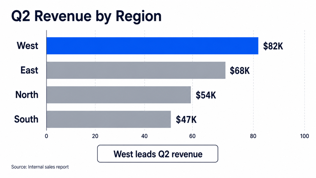
Compare Categories — Create a horizontal bar chart from @sales.csv using Region as the category and Revenue as the value. Sort highest to lowest, show direct labels, and highlight the leading region.
Track a Trend — Create a line chart from @monthly-metrics.xlsx showing Actual and Forecast Revenue by month. Use distinct line styles and annotate the largest variance.
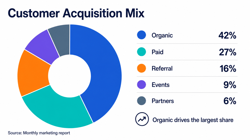
Show Part of a Whole — Create a donut chart from the five channel-share values I provide. Show percentages beside category names and confirm that the total equals 100%.
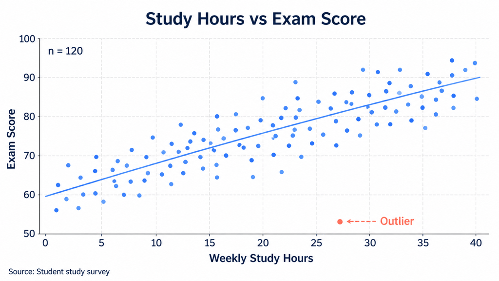
Reveal a Relationship — Create a scatter plot from @campaign-data.csv with Ad Spend on the x-axis and Conversions on the y-axis. Color points by channel and label important outliers without implying causation.
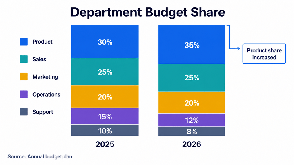
Compare Composition — Create a 100% stacked column chart comparing department budget share in 2025 and 2026. Keep the stack order consistent and annotate the largest shift.
Turn a Report Table Into a Chart — Read the quarterly metrics table in @board-report.pdf and create a grouped column chart of Revenue, Operating Cost, and Gross Profit across Q1–Q4. Include the report page in the source note.