Free OnlineAI Line Graph Generator
How to Create a Line Graph with AI
Prepare the Data and Question
Describe the Line Chart
Generate, Check, and Refine
Export for Your Audience
Why Use Mew Design for AI Line Graph Creation
Create Charts From Referenced Files
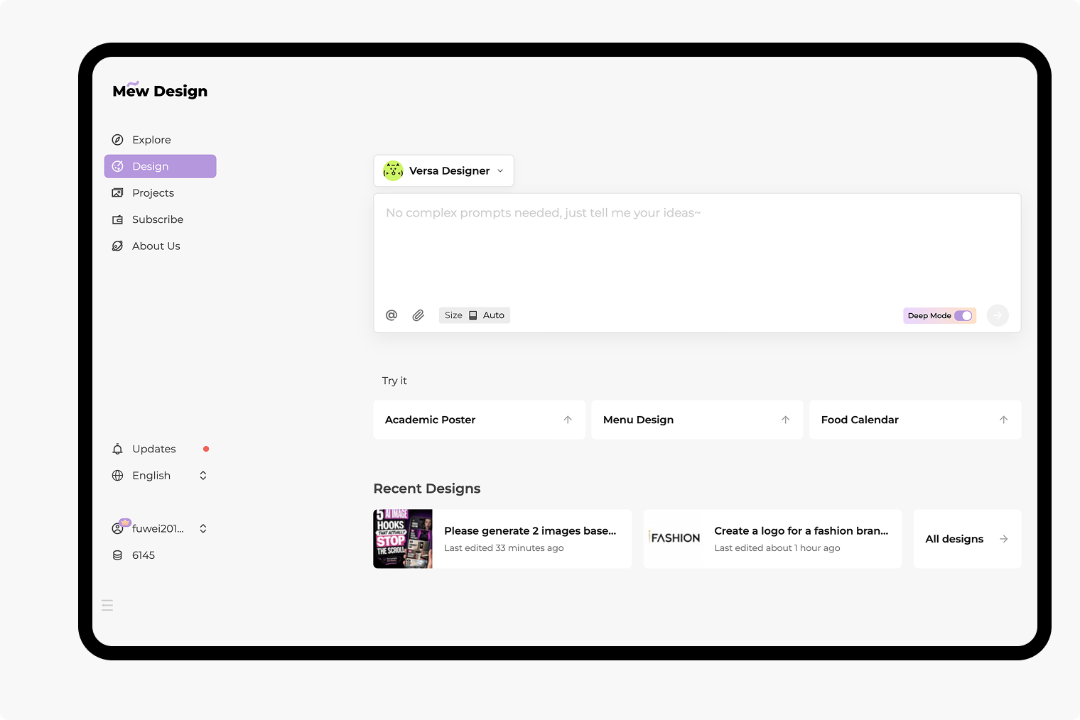
Upload CSV, XLSX, PDF, DOCX, or PPTX files to the dedicated library, reference a file with @, and tell Mew which date and metric fields to visualize. You can reference up to three related documents in one message when a comparison needs multiple sources.
Brief the Chart in Plain English
Skip a maze of spreadsheet menus. This AI line graph generator can use a request such as “compare actual and forecast revenue from January to June” to plan a useful first draft.
Compare One or More Trends
Create a single time series or a multiple line graph with distinct colors, line styles, markers, and a readable legend. Ask the AI to highlight peaks, dips, crossings, targets, or important events.
Revise Axes and Labels Through Chat
Use Chat Edit to rename axes, change units, adjust the visible range, simplify gridlines, move the legend, or add annotations. You stay responsible for reviewing the source data and final visual.
Fit Reports, Slides, and Brands
Upload a logo or visual reference and specify brand colors, fonts, aspect ratio, and tone. Create a time series graph that fits an executive deck, research report, classroom worksheet, or campaign.
Export a Finished Design
Try the free AI line chart maker with signup credits, refine the chart and surrounding layout, then export a watermark-free PNG, JPG, or PDF for digital sharing or print.
What Makes a Good AI Line Graph Prompt
- Name the Data: Identify the exact date or category field, metric columns, unit, source file, and time granularity. Reference an uploaded document with @ when needed.
- Define Each Line: State which series to compare, their order and line styles, the x-axis interval, and whether the y-axis should start at zero or use a justified narrower range.
- Guide the Reading: Request a concise title, direct labels or a legend, restrained gridlines, accessible colors, and annotations for the peaks, dips, crossings, or events that matter.
- State the Destination: Mention slide, report, dashboard, worksheet, print, or social format, plus aspect ratio, brand palette, logo, and source note requirements. Review every value before export.
Line Graph Prompts for Real Data Stories
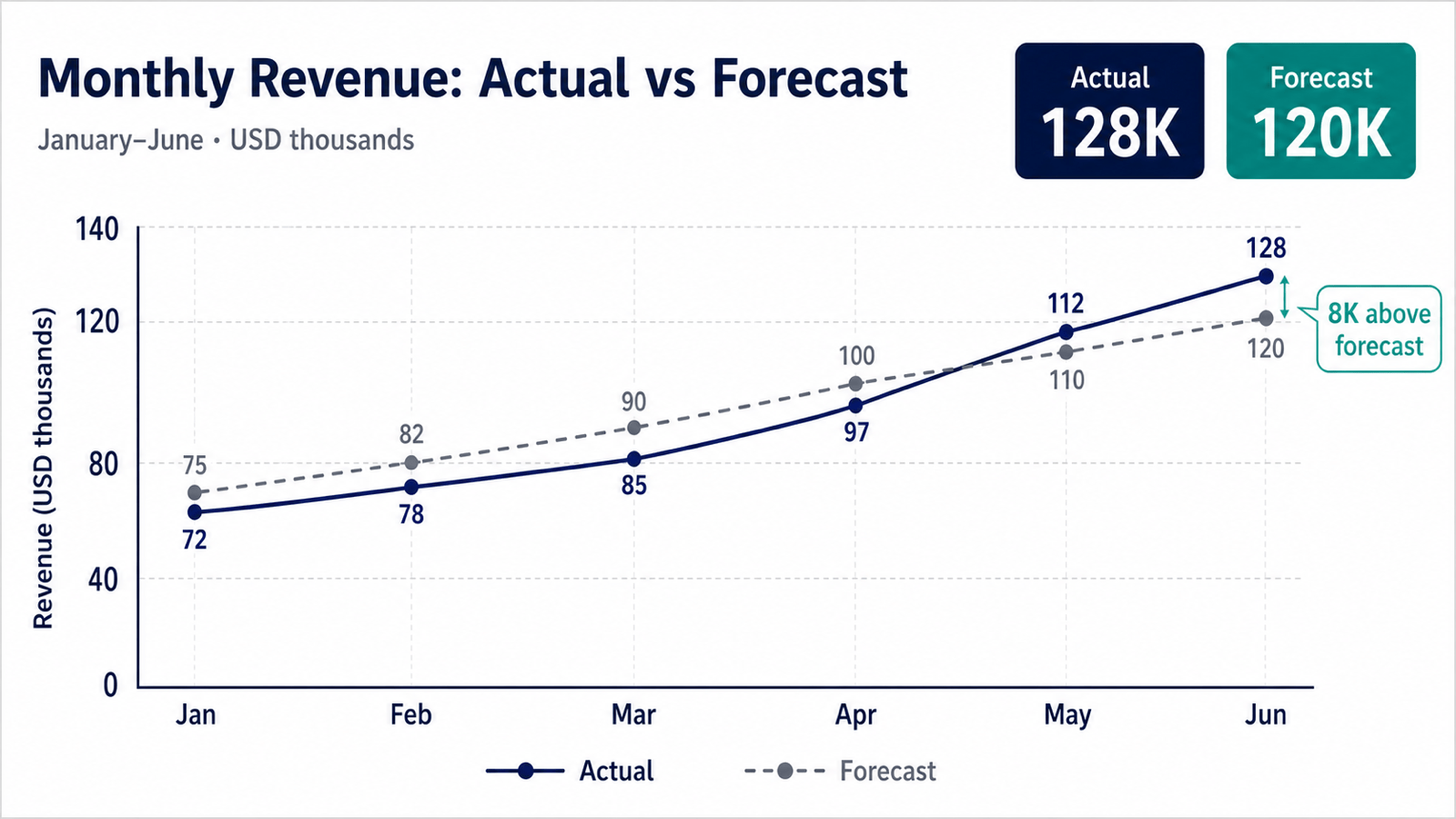
Sales Forecast: Create a 16:9 line chart from @monthly-revenue.xlsx comparing Actual and Forecast revenue from January to December. Use USD in thousands, show a solid navy line for Actual and a dashed gray line for Forecast, label the axes, annotate the largest variance, and keep the layout clean for an executive presentation.
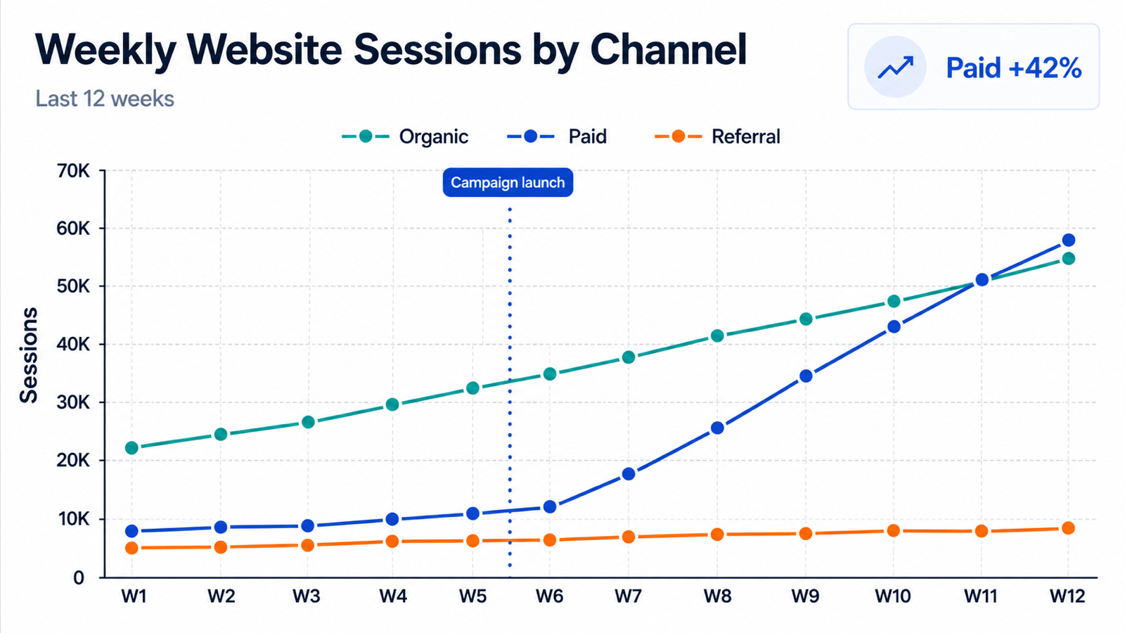
Website Traffic: Use @traffic.csv to make a multiple line graph of weekly sessions from Organic Search, Paid Search, and Referral for the last 12 weeks. Use three accessible colors, place the legend above the plot, mark the campaign launch date, and highlight the channel with the fastest growth for a marketing report.
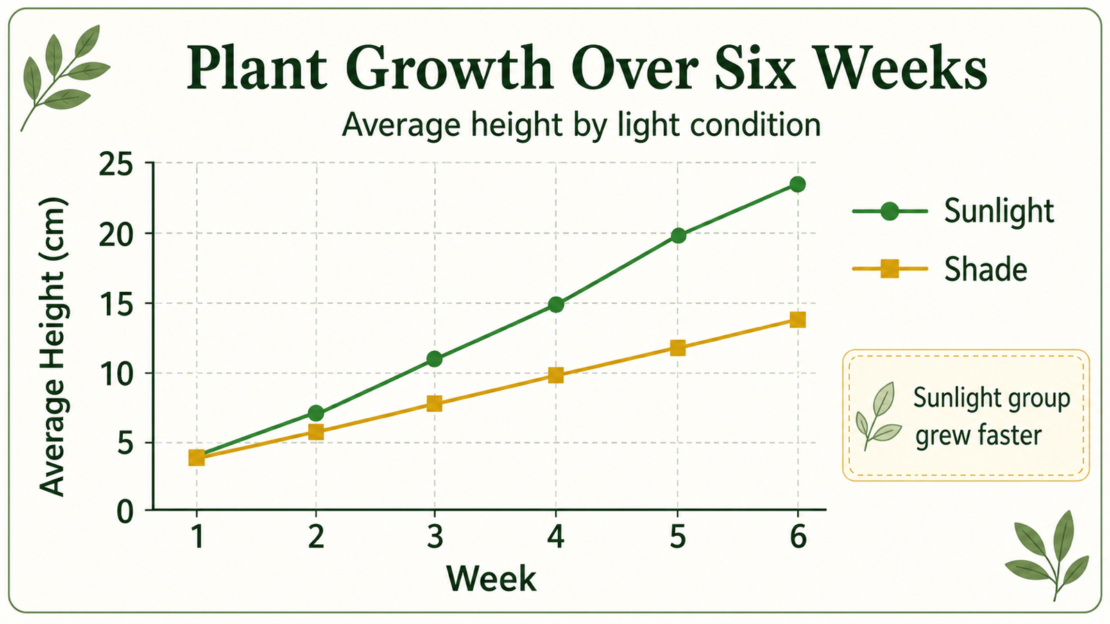
Classroom Science: Make a simple line graph showing plant height over six weeks. Sunlight group: 4, 7, 11, 15, 20, 24 cm. Shade group: 4, 6, 8, 10, 12, 14 cm. Label the axes 'Week' and 'Average Height (cm),' use clear markers, and design it for a middle-school worksheet.
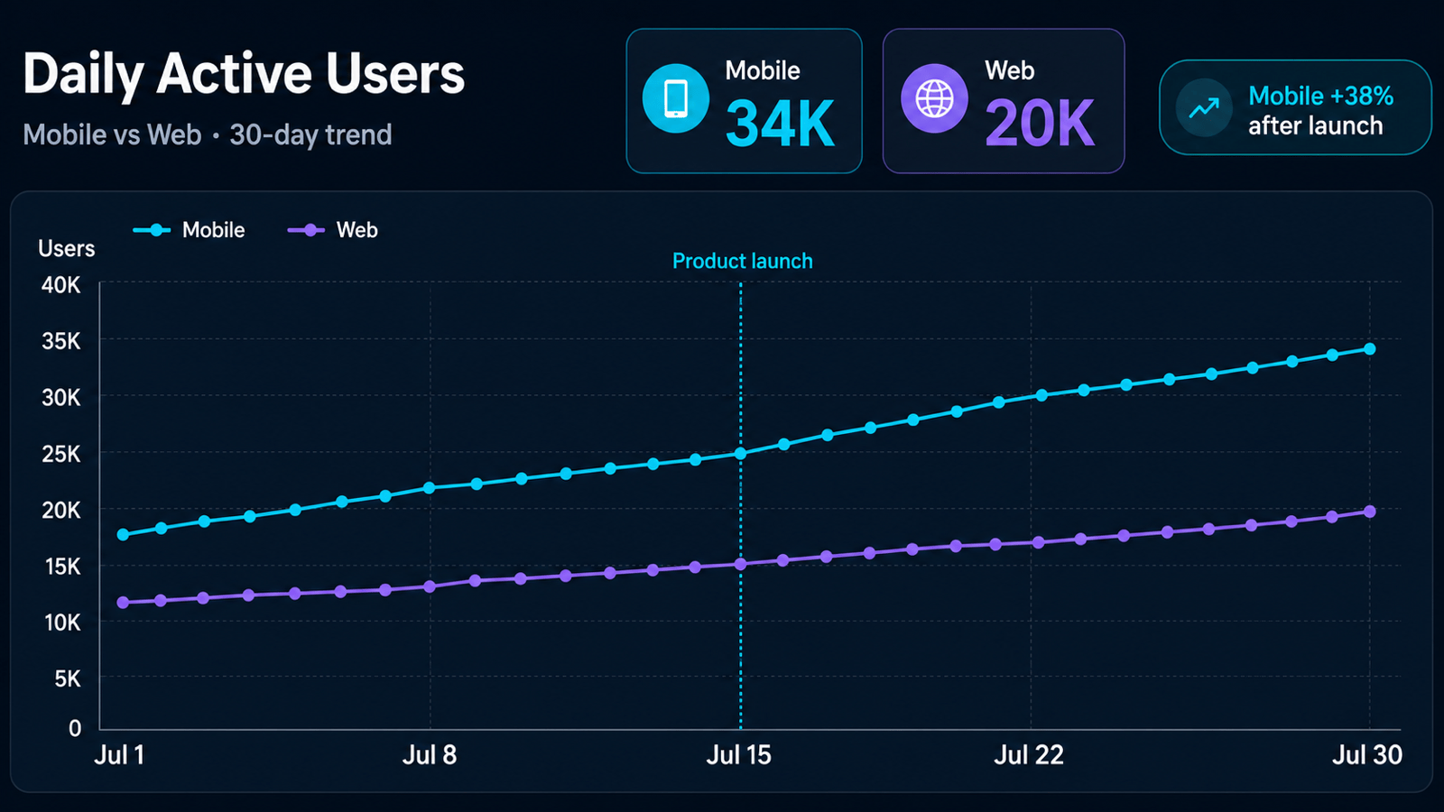
Product Analytics: Create a time series graph from @daily-active-users.csv comparing Mobile and Web daily active users across the last 30 days. Use a 7-day rolling trend, annotate the product launch, show dates at weekly intervals, and use our uploaded brand colors for a product review slide.
Temperature Comparison: Create a two-line chart for daily high temperatures in London and Paris from Monday to Sunday using the values I provide. Use degrees Celsius, distinct colorblind-safe lines, circular data markers, a compact legend, and direct labels on the final point for a travel newsletter graphic.
Energy Demand: Turn the hourly values in @building-energy.csv into a line graph for a facilities report. Plot weekday and weekend electricity demand in kW, label the morning and evening peaks, use subtle gridlines, include the source and date range, and verify every value before finalizing.