Free OnlineAI Bar Graph Generator
How to Create a Bar Graph with AI
Prepare the Data and Question
Describe the Bar Chart
Generate, Check, and Refine
Export for Your Audience
Why Use Mew Design for AI Bar Graph Creation
Create Charts From Referenced Files
Upload CSV, XLSX, PDF, DOCX, or PPTX files to the dedicated library, reference a file with @, and tell Mew which categories and values to visualize. You can reference up to three related documents in one message when a comparison needs multiple sources.
Brief the Chart in Plain English
Skip a maze of chart controls. This AI bar chart generator can use a natural-language request such as “compare Q1 revenue by region with grouped bars” to plan a practical first draft.
Match the Structure to the Story
Ask for horizontal bars when labels are long, grouped bars for side-by-side series, or stacked bars for composition. The online bar chart maker can also sort categories and emphasize the finding that matters.
Revise Labels and Layout Through Chat
Use Chat Edit to rename axes, change units, reorder categories, simplify the legend, or request a zero baseline. You stay responsible for reviewing the source data and final visual.
Bring in Brand Assets
Upload a logo or visual reference and specify brand colors, fonts, and tone. Create a bar graph that fits a board deck, research report, classroom handout, or campaign instead of looking like a default spreadsheet chart.
Export a Finished Design
Try the free AI bar graph maker with signup credits, refine the chart and its surrounding layout, then export a watermark-free PNG, JPG, or PDF for digital sharing or print.
What Makes a Good AI Bar Graph Prompt
- Name the Data: Identify the exact categories, value column, series, unit, date range, and source file. Reference an uploaded document with @ when needed.
- Choose the Comparison: Use horizontal bars for long labels, grouped bars for side-by-side comparisons, and stacked bars for parts of a total. Ask for a zero baseline unless there is a justified exception.
- Guide the Reading Order: Specify sorting, data labels, legend position, annotations, and the one category or result to emphasize. Keep color use restrained and accessible.
- State the Destination: Mention slide, report, infographic, print, or social format, along with aspect ratio, brand palette, logo, and source note requirements. Review every value before export.
Bar Graph Prompts for Real Data Stories
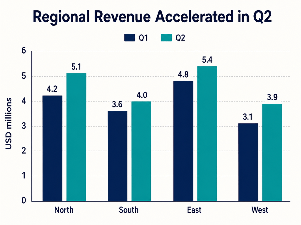
Sales Dashboard: Create a grouped vertical bar chart from @sales.csv comparing monthly revenue for Product A and Product B from January to June. Use USD, begin the axis at zero, show value labels, and highlight the month with the largest total. Design it for a 16:9 business presentation using navy, sky blue, and white.
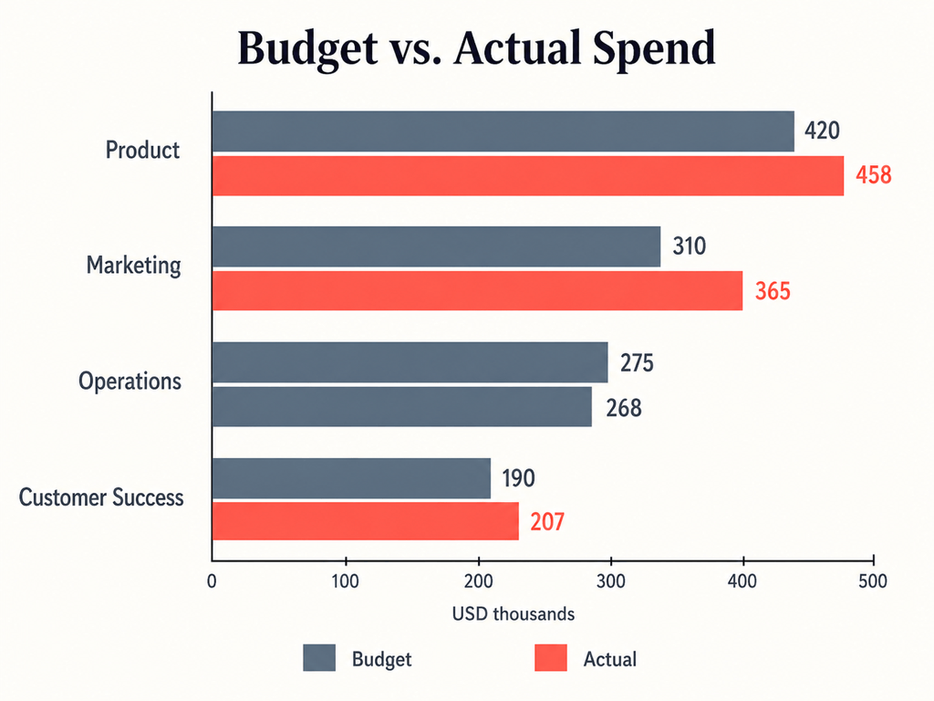
Budget Report: Use @department-budget.xlsx to make a horizontal grouped bar graph comparing budget versus actual spend for each department. Sort by the largest variance, keep long department names readable, color actual overspend coral, and add a concise source note for a PDF report.
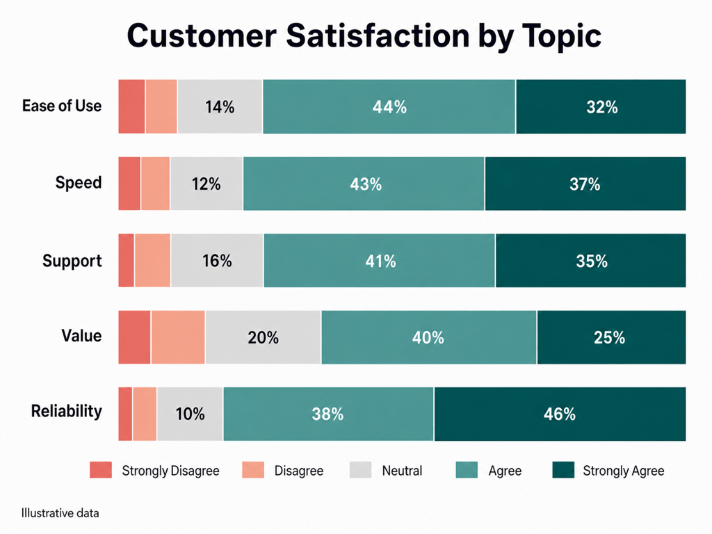
Customer Survey: Turn the response percentages in @survey-results.csv into a 100% stacked horizontal bar chart for five satisfaction questions. Order segments from Strongly Disagree to Strongly Agree, use an accessible diverging palette, label percentages above 8%, and design a clean research infographic.
Long Category Ranking: Create a horizontal bar chart from this data: Organic Search 48, Partner Referrals 36, Product-Led Signups 29, Industry Events 18, Paid Social 14. Sort descending, label each value as a percentage, use one teal accent on the top channel, and format it for a quarterly marketing report.
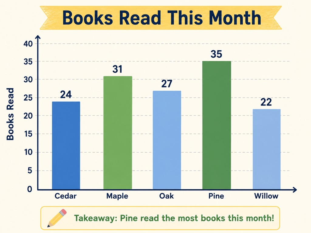
Classroom Chart: Make a simple vertical bar graph showing books read by five classes: Cedar 24, Maple 31, Oak 27, Pine 35, Willow 22. Start at zero, use friendly accessible colors, label the axes 'Class' and 'Books Read', add values above the bars, and keep the design clear for a classroom worksheet.
Social Data Card: Create a square branded data graphic with a bar chart comparing average weekly exercise minutes across four age groups using the table in @wellness-report.pdf. Use our uploaded logo and brand colors, add a short factual headline, cite the report below the chart, and verify every extracted number before finalizing.