Free OnlineAI Pie Chart Generator From Data
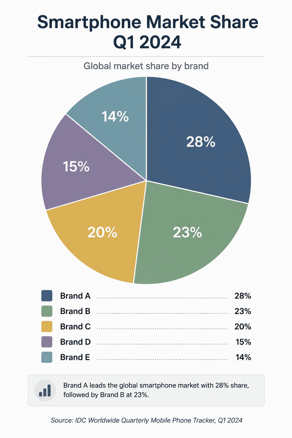
How to Create a Pie Chart With AI
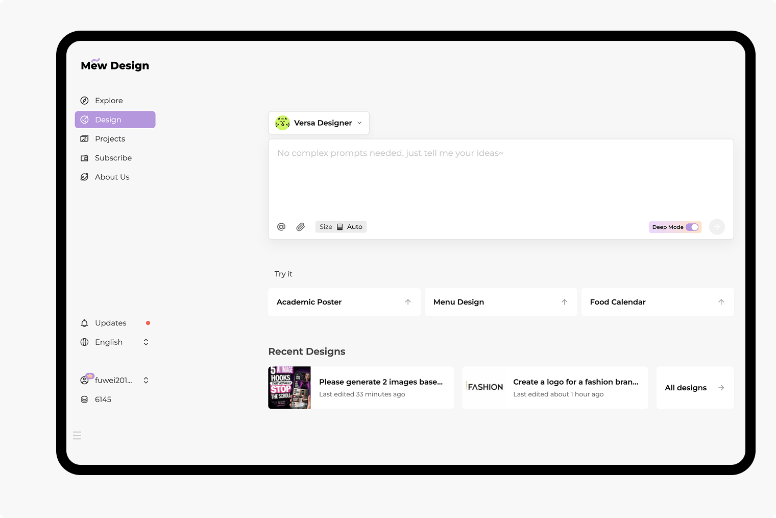
Paste Values or Reference a File
Choose Pie, Donut, or Another Chart
Generate and Verify the Breakdown
Refine the Design and Export
Create Presentation-Ready Pie Charts From Real Data
Use CSV, Excel, and Report Context
Upload CSV or XLSX files, or reference a PDF, DOCX, or PPTX report with @. Tell Mew Design which table, page, rows, or columns contain the approved source values.
Keep the Part-to-Whole Meaning Clear
Define the total and use mutually exclusive categories. The AI pie chart maker can follow instructions to sort slices, group a long tail as Other, and keep the chart focused on one composition question.
Show Values, Percentages, and Sources
Request direct labels, sensible rounding, a descriptive title, the total, and a source note. Always verify the calculation and displayed values against the original file before publishing.
Switch Between Pie and Donut
Create a classic pie chart, a donut with a central KPI, or an annotated breakdown. For trends or precise category comparisons, use the AI Chart Generator to choose a better chart type.
Apply Brand and Accessibility Cues
Reference a logo or brand palette, then request readable type, strong contrast, direct labels, and restrained color. Do not rely on color alone to communicate category meaning.
Refine by Chat and Export
Use Chat Edit to revise slices, legends, labels, annotations, and layout without rebuilding the chart. Export PNG, JPG, or PDF for a slide, report, handout, or a broader AI-generated infographic.
Create a Pie Chart From Your Data
- Provide the source: Paste a two-column table for a small dataset, or reference a CSV, XLSX, PDF, DOCX, or PPTX file with @ and name the relevant sheet, table, page, rows, or columns.
- Define the whole: State what the total represents and confirm that categories do not overlap. Raw counts are acceptable; percentages do not need to be calculated first.
- Choose the right form: Use pie for a few parts of one whole, donut when a central total helps, and a bar chart when viewers need precise comparisons or the dataset has many categories.
- Specify and verify the output: Name the title, labels, rounding, source note, aspect ratio, destination, and accessibility needs. Then check all values, totals, percentages, and claims before export.
Pie Chart Examples With Real Data
Marketing channel share: Create a donut chart from these new-customer counts: Organic Search 420, Paid Search 280, Referral 170, Events 80, Partners 50. Sort descending, label each segment with name and percentage, place Total 1,000 in the center, highlight Organic Search, and format it for a 16:9 monthly report slide.
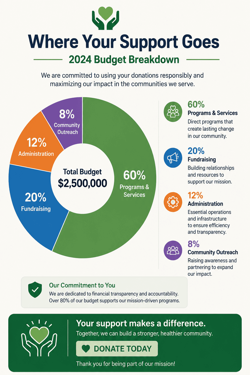
Nonprofit budget: Use @fy-budget.csv to create a pie chart of approved annual spending by Program Services, Fundraising, Administration, and Grants. Use exact values from the file, add percentage labels and a source note, group no categories without approval, and prepare a print-friendly report version.
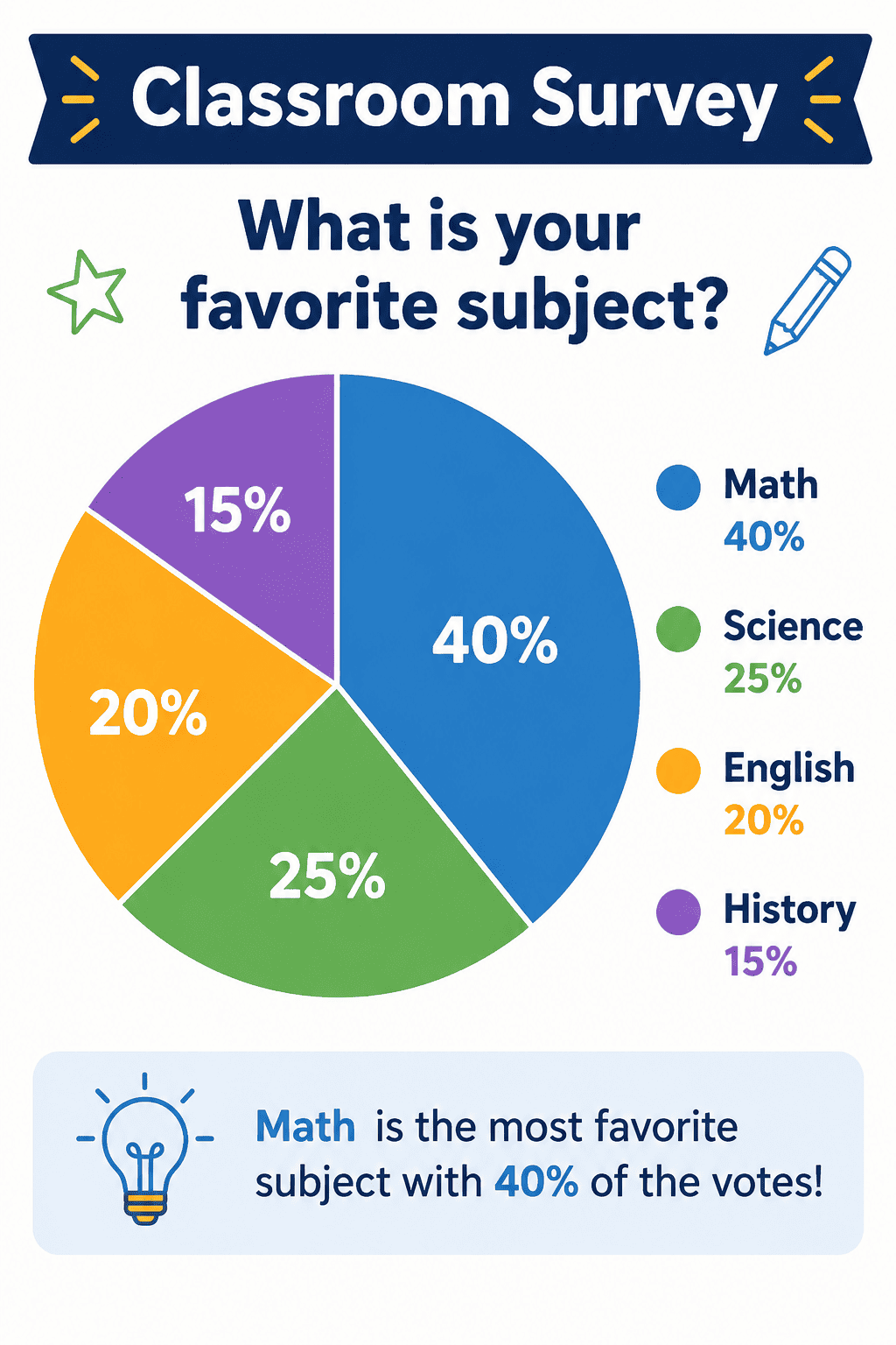
Classroom survey: Turn these responses into a simple pie chart: Science 12, Art 9, Sports 7, Music 6, Reading 6. Use five accessible colors, large direct labels, the title Favorite After-School Activity, and a clean landscape layout for a classroom handout.
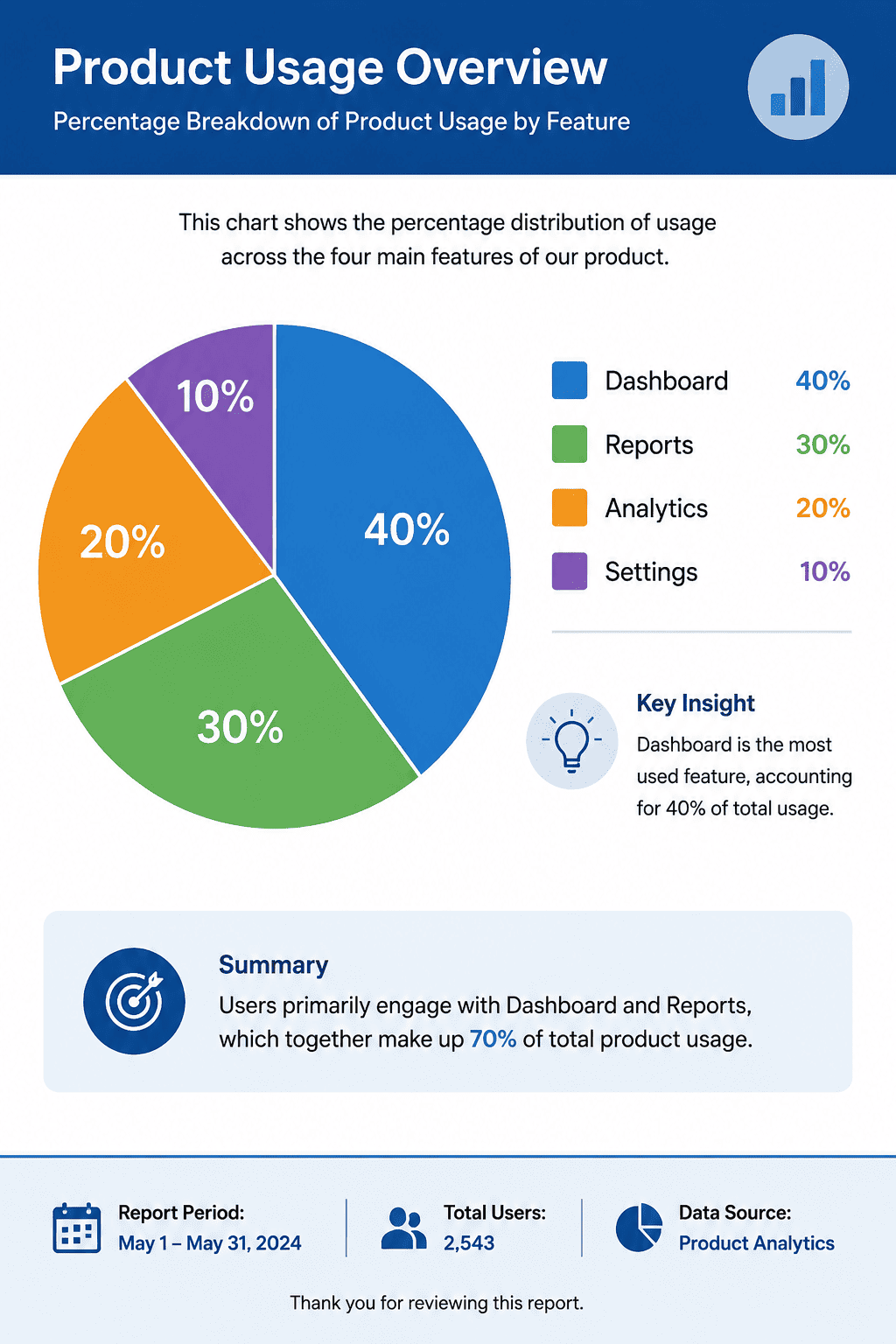
Product usage: Use @feature-usage.xlsx to make a donut chart showing the share of weekly active users by primary feature. Limit the chart to the five largest mutually exclusive categories, combine the approved remainder as Other, show one-decimal percentages, add the sample size and week-ending date, and verify the total before export.