Free OnlineAI Scatter Plot Generator From CSV or Excel
How to Create a Scatter Plot With AI
Prepare Paired Data
Reference the Spreadsheet
Check the First Plot
Refine and Export
Built for Data-to-Chart Workflows
Start From CSV or Excel
Reference spreadsheet files instead of retyping a long table. Tell Mew Design which worksheet or named columns contain the paired values you want to plot.
Map X and Y in Plain Language
Describe the question behind the data, then assign X, Y, category color, and optional point size. This online AI scatter plot maker turns that brief into a structured visual direction.
Handle Groups, Outliers, and Bubbles
Separate cohorts by color, size points by a third measure, reduce overlap with smaller transparent marks, or label only the observations that matter.
Refine the Explanation Through Chat
Use Chat Edit to rename axes, change a range, move a legend, simplify gridlines, add annotations, or request a restrained line of best fit without rebuilding the chart.
Keep Statistical Claims Reviewable
The free AI scatter plot generator helps prepare the visual, but you should verify imported values, equations, R², units, and interpretations. For broader analysis, explore the AI Statistics Generator.
Move the Chart Into a Finished Story
Use the verified plot in an AI-generated chart set, infographic, or academic poster, then export it for the final audience.
Check Your Data Before You Plot
- Check the pairing: Confirm that every row represents one observation and that the selected X and Y cells are numeric, aligned, and expressed in the intended units.
- Resolve missing values: Decide whether blanks, duplicate rows, or invalid values should be excluded. Do not let the chart silently invent, interpolate, or reorder observations.
- Use honest scales: Review axis limits and use a log scale only when the data range and audience justify it. Treat trendlines and R² as analytical aids, not proof of causation.
- Reduce visual crowding: For dense datasets, try smaller points, lower opacity, group colors, selected labels, or a different chart such as a hexbin rather than labeling every mark.
Scatter Plot Examples for Real Data Questions
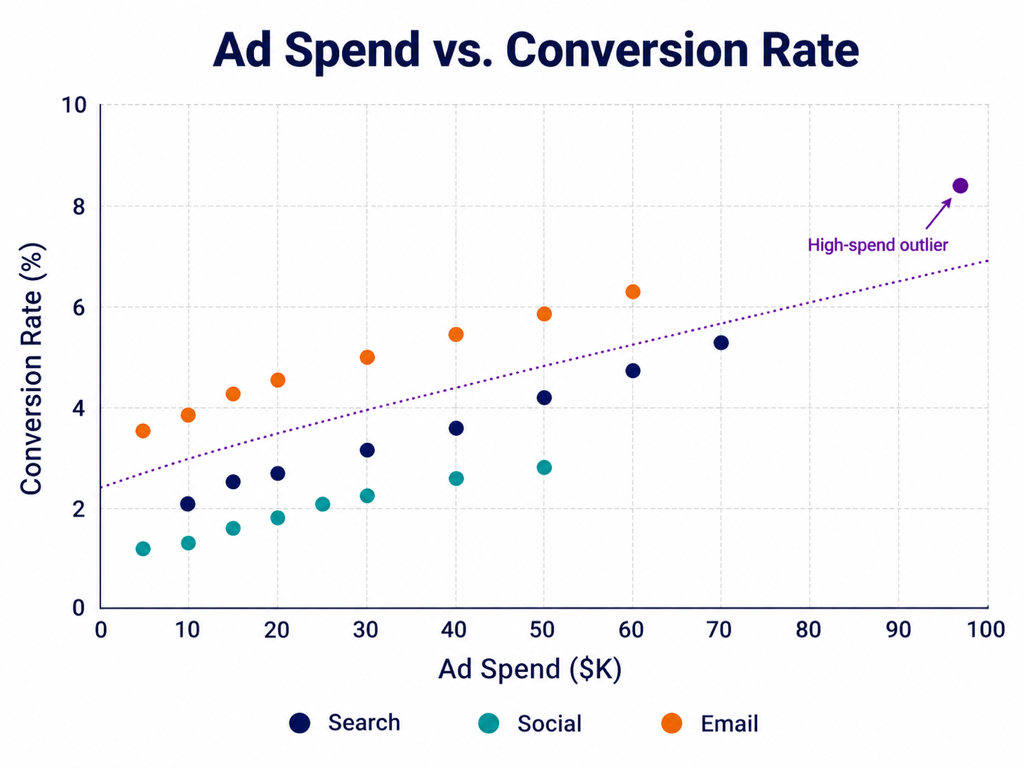
Marketing Performance — Compare ad spend with conversion rate, color campaigns by channel, and label the largest outlier for a quarterly review.
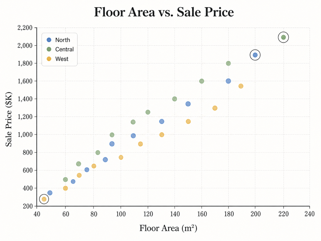
Housing Prices — Plot floor area against sale price, separate neighborhoods by color, and use transparent points to reveal overlap in a market report.
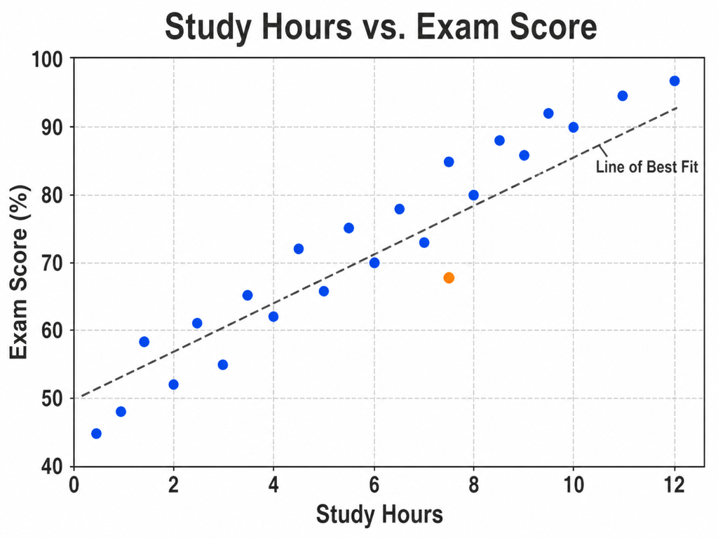
Student Outcomes — Compare weekly study hours with exam scores, include units and a restrained line of best fit, and format the result for a classroom slide.
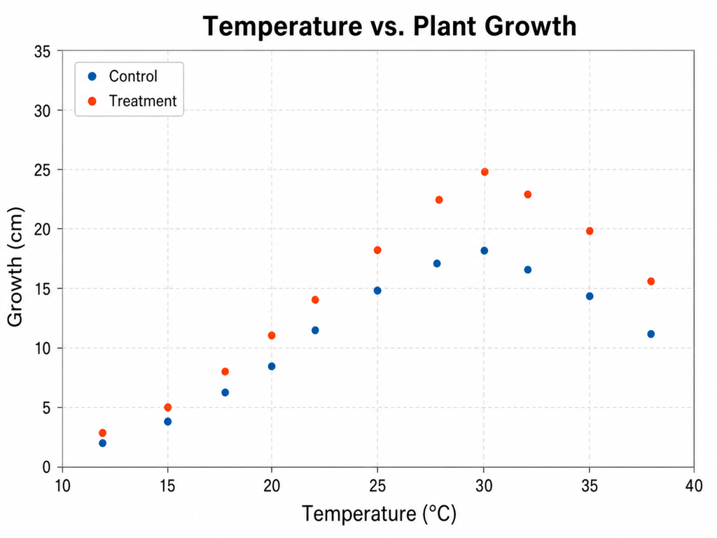
Research Figure — Plot temperature against plant growth by treatment group, preserve measured values, and use publication-style labels without adding an unsupported trendline.
Customer Bubble Chart — Map satisfaction against retention, size points by customer count, and add benchmark quadrants to compare plan tiers.
AI Model Evaluation — Compare response latency with task accuracy, color by model family, label Pareto-efficient points, and use a log scale only if the range warrants it.