Free OnlineAI Statistics Generator
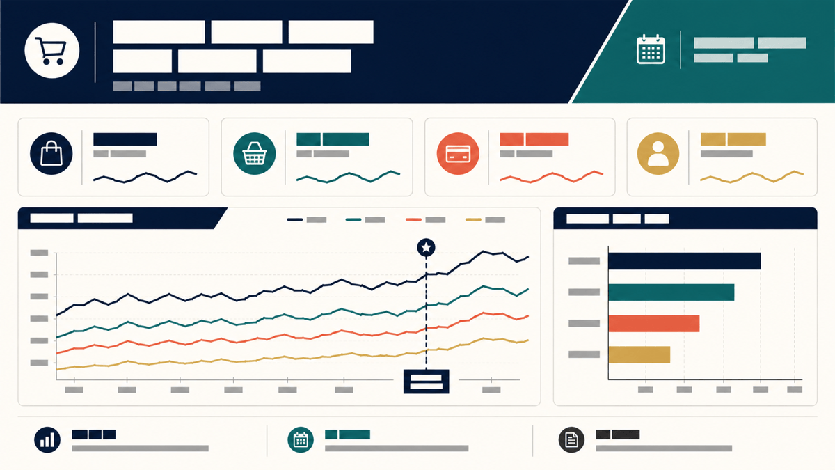
Turn verified datasets, survey results, or report findings into statistical charts that carry their context. Mew Design - AI Design Agent works as an AI statistical chart maker for KPI cards, distributions, comparisons, trends, relationships, and multi-chart visual summaries—ready for reports, presentations, lessons, and social content.

How to Generate Statistics Graphics with AI

Start with the question the numbers must answer. A comparison, trend, distribution, relationship, and headline metric need different visual structures—and each needs enough context to remain truthful.
1

Define the Statistical Question

State whether you need to show a comparison, trend, distribution, relationship, composition, or headline metric. Identify the population or sample, measure, unit, denominator, time period, and audience before choosing a style. Use verified statistics rather than asking the design agent to invent or estimate them.
2

Add or Reference Verified Data

Paste a clean table, or upload a PDF, DOCX, XLSX, PPTX, CSV, text, Markdown, or another common document to the file library. Type @ to reference the file, name the exact sheet, columns, pages, or table, and specify which values to use. You can reference up to three documents in one message.
3

Match the Chart to the Relationship

Use bars or dots for comparison, a line for change over time, a histogram or box plot for distribution, a scatterplot for relationships, or a labeled stat card for one headline measure. Ask the AI statistics generator to include units, sample size, uncertainty, annotations, and a source area where they matter.
4

Verify, Refine, and Export

Compare every value, label, calculation, axis scale, denominator, interval, and source note with the original data. Use Chat Edit to simplify the hierarchy, correct one label, change the chart form, improve contrast, or resize the composition. Export the reviewed design as PNG, JPG, or PDF when that format fits your project.
How to generate statistics graphics with AI

Statistical Graphics That Keep the Context Visible

Choose a Chart by the Question

A ranking, time series, distribution, and correlation should not share the same default chart. Describe the analytical question and the AI statistical chart maker can organize the design around the relationship instead of forcing every dataset into a generic graph.

Create from Tables and Reports

Upload spreadsheets, survey reports, research papers, presentations, CSV files, text, or Markdown, then reference the relevant file with @. Point to exact sheets, columns, pages, or sections so the design follows your approved source rather than a loose summary.

Preserve Statistical Context

Request the sample size, denominator, population, unit, geography, and time period alongside the headline value. Keeping these qualifiers close to the chart helps readers understand what the statistic measures and prevents a polished number from becoming an unsupported claim.

Show Uncertainty and Sources

Add precomputed confidence intervals, margins of error, missing-data notes, definitions, or methodology qualifiers when they affect interpretation. Reserve a clear source area and verify every interval and note before publishing the final statistics graphic.

Build a Complete Statistics Story

Combine a message-led headline, KPI cards, one or more coordinated charts, concise annotations, and a source footer in a single report, slide, dashboard panel, or social layout. For a broad standalone chart, use the AI chart generator.

Refine the Design, Verify the Analysis

Use Chat Edit to change layout, labels, emphasis, color, or output size while preserving reviewed values. Mew Design is a design and presentation agent, not a statistical analysis engine: calculate and validate p-values, confidence intervals, regression results, weighted estimates, and significance in dedicated statistical software first.

How to Write an Effective AI Statistics Prompt

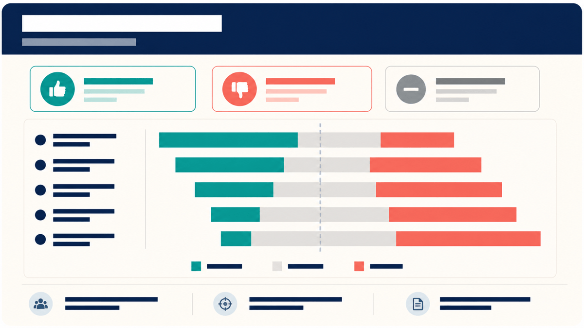
Create a 16:9 employee survey statistics slide from the verified table in @[engagement-results.xlsx], sheet "Q2 Summary", cells A1:F8. Show three KPI cards for response rate, favorable score, and year-over-year change, plus a diverging horizontal bar chart for four response categories. Preserve every value exactly. Include base n=1,240, survey dates, the supplied margin of error, direct labels, a short source footer, and accessible navy, teal, coral, and gray colors. Do not calculate missing values or imply causation.
A useful AI statistics generator prompt supplies the verified numbers or exact source location, the question to answer, the intended reader, and the output format. Treat the design as a presentation layer for reviewed analysis, not as a substitute for statistical calculation.
  • Define every measure: Name the population or sample, metric, unit, denominator, time period, comparison basis, and whether values are counts, percentages, rates, indices, or estimates.
  • Choose by relationship: Request bars or dots for comparisons, lines for time, histograms or box plots for distributions, scatterplots for relationships, and stat cards for a single headline measure.
  • Protect statistical context: Supply precomputed intervals, margins of error, sample size, missing-data notes, definitions, and source details. State explicitly that Mew must not invent or recompute them.
  • Design for reading and access: Specify aspect ratio, destination, label density, axis treatment, contrast, direct labels, and a text summary or accessible table for any complex chart published online.

AI Statistics Generator Prompts for Reports and Presentations

Employee survey summary: Create a 16:9 statistics slide from @[people-survey.xlsx], sheet "Results". Use the verified response rate and three favorable-score KPIs, then show five survey items as diverging horizontal bars. Preserve the exact percentages, display base n and survey dates, include the supplied margin of error and source, and use direct labels rather than a color-only legend.

Quarterly ecommerce performance: Reference @[commerce-q1-q4.csv] and generate a report-ready statistics dashboard with revenue and conversion KPI cards, a monthly revenue line chart, and horizontal bars for channel conversion. Keep currency, percentage units, and date range visible; annotate only the two events listed in the file; do not infer causes for changes.

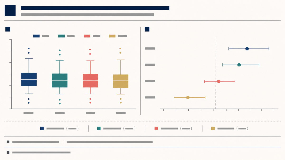
Research distribution figure: From Table 2 in @[study-results.pdf], create a two-panel statistical graphic with box plots for the four verified groups and a dot-and-interval plot for the precomputed estimates and 95% confidence intervals. Include group sample sizes, units, figure subtitle, and source note. Do not calculate significance or add brackets not present in the table.

Student score distribution: Use the verified values in @[assessment-summary.xlsx], sheet "Grade 8", to create a histogram with consistent bins, a compact box plot, and stat cards for the supplied mean, median, and sample size. Label the assessment window and score scale, keep the zero-to-100 range, and add a note for missing records.

A/B test visual summary: Turn the approved output in @[experiment-readout.md] into a presentation graphic comparing control and treatment conversion rates. Show the absolute lift, relative lift, and precomputed 95% confidence interval exactly as written. Include exposure counts and analysis dates, avoid a truncated scale, and do not recalculate significance or claim causation beyond the approved conclusion.

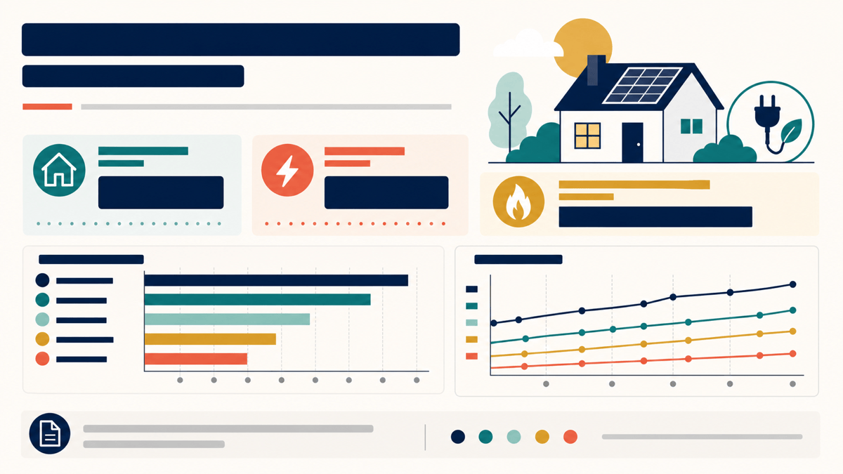
Public energy statistics infographic: Read pages 6–8 of @[household-energy-report.pdf] and create a portrait statistics infographic with three verified headline stat cards, a regional comparison bar chart, and one small trend chart. Add plain-language annotations, units, reporting period, a specific source footer, high contrast, and a companion text-summary outline.

AI Statistics Generator FAQs

Yes. New users receive free AI credits to create and refine an initial statistical graphic. You can use Chat Edit for revisions and download completed artwork without a watermark; credit use depends on the generation workflow you choose.
It turns verified data and statistical findings into designed visual outputs such as KPI cards, comparison charts, survey summaries, distributions, scatterplots, multi-panel figures, slides, and statistics infographics. It is most useful when you already know the values and need a clear way to present them.
Do not rely on a design agent for statistical validation. Calculate and review means, medians, confidence intervals, p-values, regressions, weighted percentages, and significance in appropriate statistical software, then give Mew the approved results to visualize. Always compare the generated labels and numbers with the source.
Yes. Upload PDF, DOCX, XLSX, PPTX, CSV, text, Markdown, and other common document formats to the file library. Reference a file with @ and name the exact sheet, columns, pages, table, or section. Up to three documents can be referenced in one message; verify all extracted values before publishing.
Use bars or dots for comparisons, a line chart for change over time, a histogram or box plot for distributions, a scatterplot for relationships, and stat cards for headline measures. Use the AI bar graph generator for a focused ranking or the AI line graph generator for a focused time series.
Check every value, label, unit, denominator, sample size, time period, axis scale, interval, annotation, and source. Avoid 3D effects, excessive decoration, truncated axes that exaggerate differences, unsupported causal language, and dual axes that invite false comparisons. Keep important uncertainty and limitations visible.
Yes. Use Chat Edit to change the chart type, hierarchy, labels, annotations, palette, spacing, or aspect ratio without rewriting the entire brief. Export the reviewed design as PNG, JPG, or PDF when that format fits your report, slide, classroom material, or social post.
Use readable horizontal labels, sufficient contrast, direct labels, and shapes or line styles in addition to color. For a complex web chart, provide concise alt text plus a longer description, text summary, accessible table, or downloadable data that conveys the essential values and relationships. For a longer visual narrative, try the AI infographic generator.

Ready to Generate Designs With AI?

Get Started - 50 Free Credits
No credit card required
© 2025 - 2026 Mew Design, MAGOAI LTD.All rights reserved.
Mew Design - Your AI design partner, now with full control. | Product Hunt