Free OnlineAI Icon Generator



How to Create an Icon with AI
Define the Meaning and Destination
Set the Icon's Visual Grammar
Generate and Test the Silhouette
Polish the Edges and Prepare the File
Icon Design Without the Mismatched Library Hunt
Start with Meaning, Not a Stock Keyword
Explain what the icon should communicate in everyday language. The AI design agent can translate a feature, action, category, or product idea into a focused visual direction, so you are not limited to the closest symbol available in a generic library.
Art-Direct a Complete Icon Family
Create related icons in one request and hold the shared rules constant: stroke or fill treatment, palette, corner language, perspective, safe area, and visual weight. This AI icon set generator workflow makes inconsistencies easier to spot before you choose final versions.
Follow Brand Colors and References
Upload a logo, screenshot, mood board, existing icon, or interface reference and ask Mew Design to follow its geometry, color system, and level of detail. A concrete visual reference is especially helpful when words such as “modern” or “minimal” are too broad.
Design for Recognition at Small Sizes
The online AI icon maker can explore simpler silhouettes, fewer internal parts, stronger figure-ground contrast, and more generous padding. Inspect the result at the size used in navigation, a feature card, dashboard, mobile tile, or slide before approving it.
Correct One Visual Problem at a Time
Use Chat Edit to replace the central metaphor, thicken an outline, remove a shadow, standardize corner radii, rebalance margins, or align one drifting icon with the rest of the set. Focused edits make the next version easier to evaluate.
Try Styles and Export Without a Watermark
Start the free AI icon generator with signup credits, compare flat, outline, filled, duotone, sticker, or hand-drawn directions, and export selected visuals without a watermark as PNG, JPG, or PDF for digital content and presentations.
How to Prompt AI for Clear, Consistent Icons
- Lock the Construction Rules: Choose outline, filled, or duotone construction; set stroke weight, corner treatment, detail level, perspective, shadow behavior, padding, and background. Avoid mixing visual systems in one family.
- Keep the Set Measurable: List all subjects in one prompt and require the same canvas, scale, optical weight, palette, line or fill treatment, and empty space. A comparison grid makes mismatches easier to see.
- Design for the Final Size: Mention whether the icon is for mobile navigation, a website feature card, a large app tile, a dashboard category, or a presentation. Smaller placements need fewer parts and stronger contrast.
- Exclude Common Distractions: Ask for no words, letters, random badges, unnecessary frames, busy scenery, tiny ornaments, multiple competing symbols, inconsistent baselines, or mixed perspectives unless the concept truly needs them.
Icon Prompts for Apps, Websites, and Products
SaaS Feature Set: Create four matching flat duotone icons for automation, analytics, team approvals, and account security. Use one navy-and-cyan palette, simple filled geometry, rounded corners, equal optical weight, centered symbols, and 20% clear padding. Arrange them in a 2 × 2 grid. No text or extra decoration.
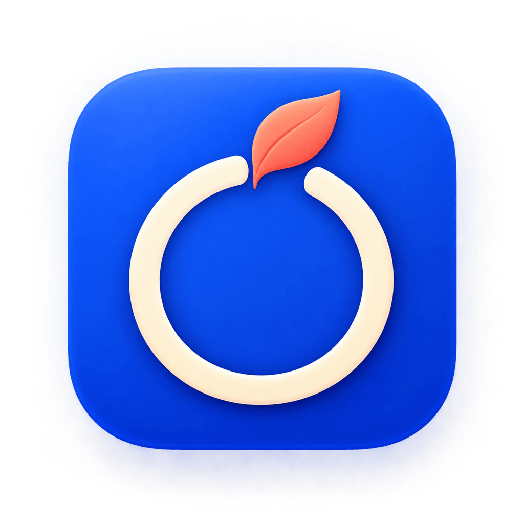
Productivity App Icon Concept: Design a bold square app icon for a focus timer. Use a rounded cobalt tile, one cream circular timer ring, and a small coral leaf at the top to suggest calm concentration. Keep the silhouette readable, the center uncluttered, and enough safe area for platform cropping. No words, numbers, or logo copies.
E-commerce Category Icons: Generate a cohesive set for new arrivals, eco products, gift cards, and fast delivery. Use friendly filled pictograms, dark forest green with one warm yellow accent, consistent rounded bases, transparent-placement edges, and no shadows. Keep every symbol distinct at small size.
Healthcare Navigation Set: Create six clean outline icons for appointments, doctors, prescriptions, test results, insurance, and urgent care. Use a consistent 2.5-pixel visual stroke, rounded line caps, blue and teal accents, simple front-facing symbols, equal padding, and a plain white background. Avoid medical text and excessive detail.
Game Inventory Icons: Make four matching fantasy inventory icons for a health potion, shield, brass key, and gold coin pouch. Use a compact hand-painted style, three-quarter view, one upper-left light, dark violet outlines, consistent bases, and a transparent-ready silhouette. No characters, labels, or elaborate scenery.
Brand Reference to Icon Set: Use my uploaded café logo and menu screenshot as visual references. Create four matching category icons for coffee, tea, pastry, and pickup. Follow the brand's terracotta-and-cream palette, rounded hand-drawn line style, visual weight, and spacing without copying the logo mark itself.