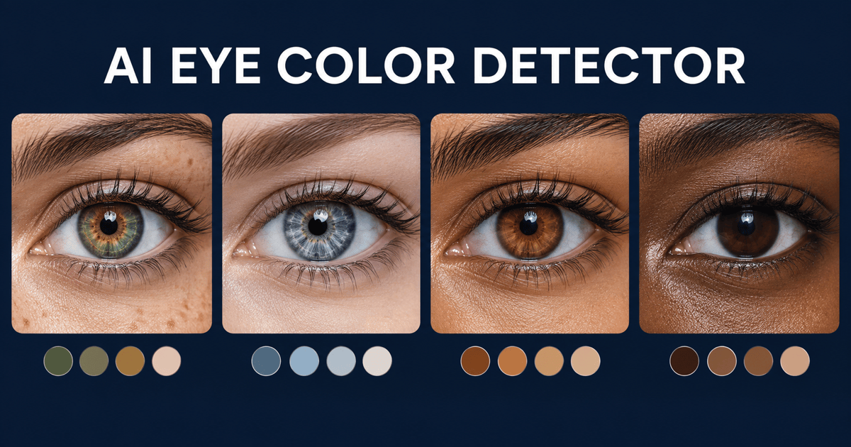
Free OnlineAI Curve Graph Generator
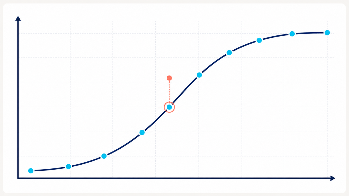
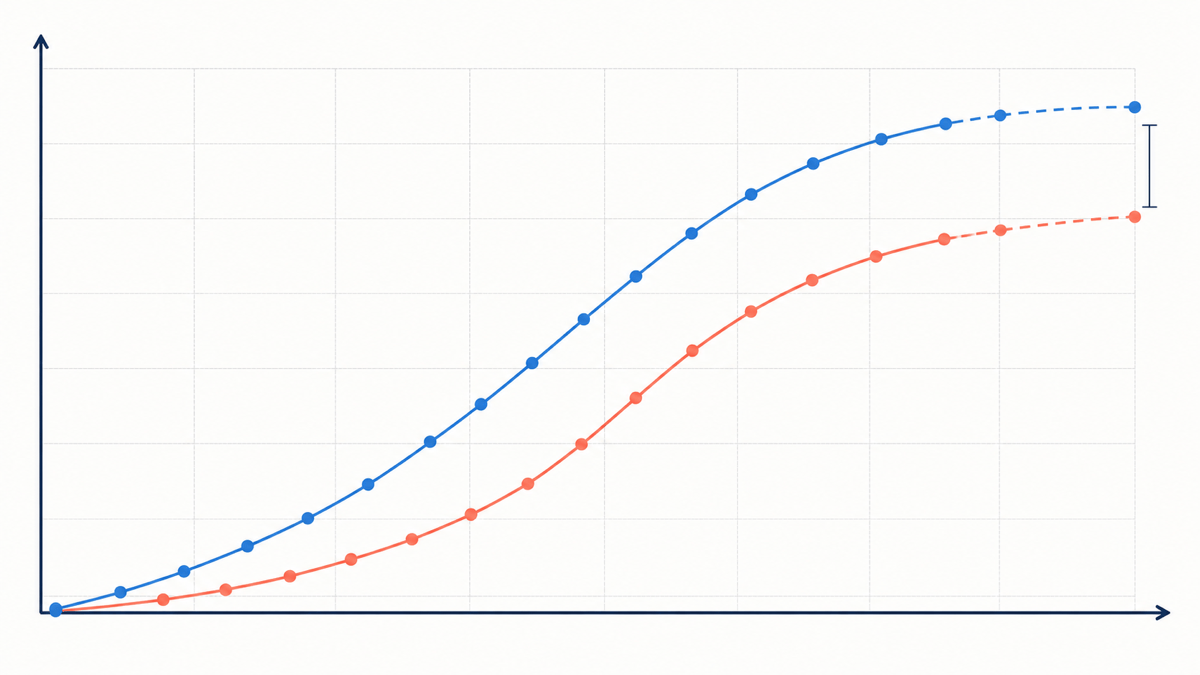
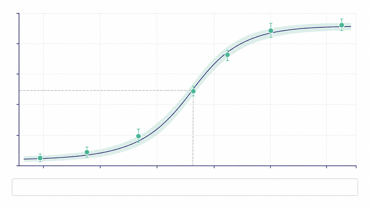
How to Create a Curve Graph with AI
Define the Curve's Message
Add or Reference Your Data
Choose an Honest Curve Treatment
Verify, Refine, and Export
Curve Graphs Designed to Explain, Not Distort
Match the Curve to the Story
Explain whether the data represents cumulative progress, distribution, saturation, response, learning, or decline. The AI design agent can organize the graph around that reading instead of applying the same generic rising line to every dataset.
Keep Axes and Units Visible
Our online AI curve chart generator can build a clear hierarchy for title, axes, units, source, annotations, and the curve itself. Ask for labels that remain legible in a report, slide, classroom handout, or social crop.
Show Observations Behind the Curve
Retain data-point markers when readers need to see where measurements were collected. Distinguish observed and forecast sections with markers, dash styles, or labels so a smooth curve does not pretend that every point was measured.
Compare Smoothing Before You Commit
Generate a restrained smooth version and a straight point-to-point version from the same values. If the curved line overshoots, hides volatility, or changes the apparent timing of a peak, keep the more faithful treatment.
Turn Source Documents Into a Graph
Upload a spreadsheet, report, slide deck, CSV, text, or Markdown file, then reference it with @ in the design conversation. Mew can read the selected content and create the requested curve graph; you can reference up to three documents in one message when a comparison needs multiple approved sources.
Build in an Accuracy Checkpoint
Mew Design helps create and refine the presentation layer; it is not a substitute for statistical analysis or a symbolic graphing calculator. Verify equations, regressions, confidence bands, and source data independently before publishing the final visual.
How to Prompt AI for an Accurate Curve Graph
- Name the curve family: Say S-curve, bell curve, sigmoid, exponential decay, cumulative progress, learning curve, or verified function. Explain what the shape means in this specific context.
- Control interpolation: Ask for straight segments when each point is discrete. If the phenomenon is continuous, request restrained or monotonic smoothing and explicitly forbid overshoot, false peaks, and values outside the supplied range.
- Specify chart anatomy: Include title, x/y labels, units, axis bounds, point markers, line styles, legend or direct labels, source note, confidence band, and the exact annotations you need.
- Design for the destination: State 16:9 slide, report column, dashboard card, classroom handout, or social graphic. Add brand colors and contrast needs, but keep the curve and labels more prominent than decoration.
Curve Graph Prompts for Growth, Research, and Learning
SaaS adoption S-curve: Create a 16:9 curve graph from these verified monthly adoption values: 3%, 5%, 9%, 18%, 35%, 58%, 77%, 89%, 95%. Use monotonic smoothing, visible markers, a 0–100% y-axis, direct labels, and one annotation where adoption passes 50%. Professional navy and cyan slide style; no invented values or 3D effects.
Project progress S-curve: From @[project-progress.xlsx], plot cumulative planned versus actual completion for Weeks 1–12 using the Approved Progress sheet. Use two restrained curves, round markers for observed weeks, dashed lines after the forecast cutoff, percentage axis from 0 to 100, and a callout where actual progress falls behind plan. Clean construction-report layout; do not infer missing weeks.
Dose-response sigmoid: Turn the verified concentration and response table I provide into a publication-style sigmoid curve. Use a logarithmic concentration axis only if the supplied values require it, show observed points and the approved confidence band, label EC50 with the exact value I provide, and leave a source note. No fabricated fit statistics.
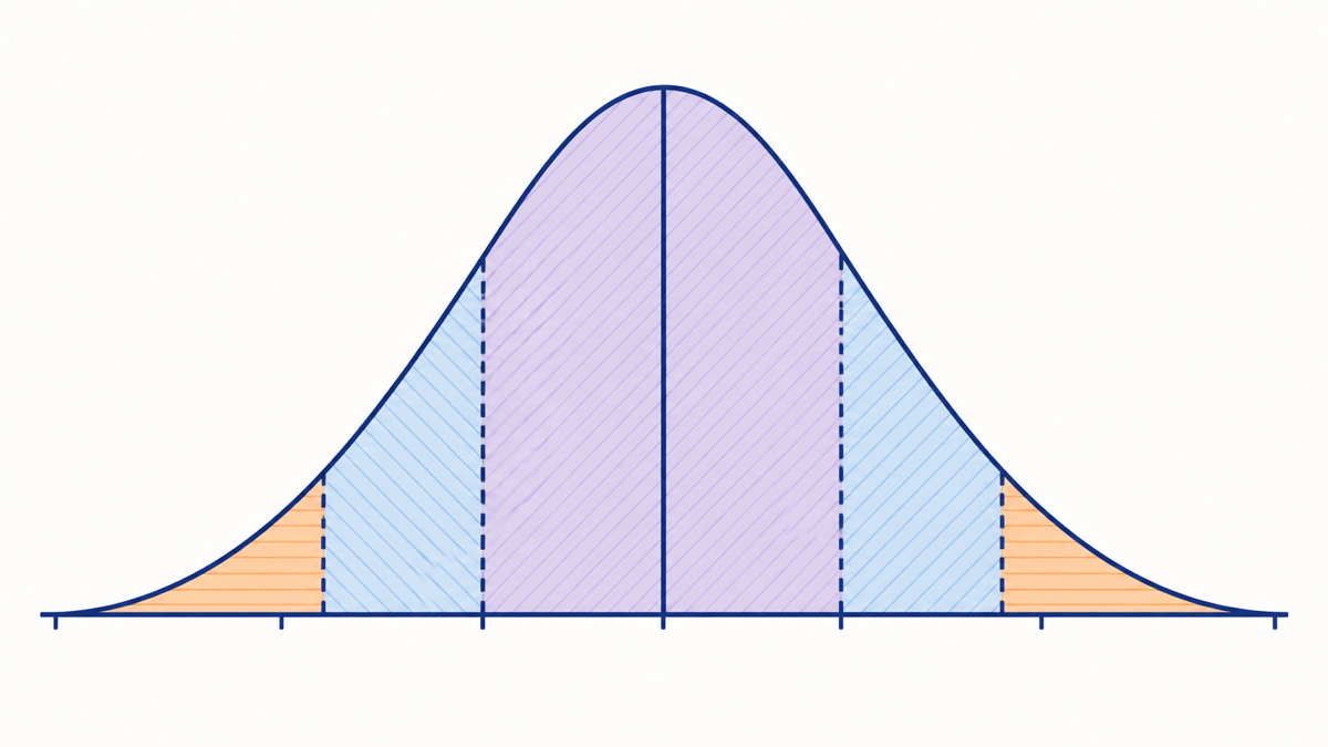
Bell curve teaching graphic: Create a clear 16:9 normal-distribution illustration with one symmetric curve, a center marker for the mean, and three softly separated standard-deviation regions. Minimal classroom style, accessible blue and orange accents, labels outside the curve, no decorative 3D perspective or unrelated data claims.
Retention decay curve: Visualize verified cohort retention from Day 0 to Day 30 with markers at each measured interval. Use a smooth decline only between observed points, annotate the steepest verified drop, keep gridlines light, and add a compact data-source note. Format for a product review slide in dark mode.
Quadratic curve from coordinates: Design an educational coordinate graph using these verified points for y = x²: (-3,9), (-2,4), (-1,1), (0,0), (1,1), (2,4), (3,9). Show x/y axes, integer ticks, point markers, a smooth symmetric parabola through the points, and label the vertex (0,0). Do not add extra intersections or equations.