Free OnlineAI Hand Lettering Generator
How to Create Hand Lettering with AI
Lock the Words and Hierarchy
Describe the Lettering Tool
Generate and Inspect the Rhythm
Refine for the Final Material
Control the Rhythm Behind Hand-Drawn Letters
Preserve Exact Phrases
Quote every word and line break. If a letter is missing or malformed, select only that region in Chat Edit and request the precise correction without losing the surrounding illustration.
Define a Real Stroke System
Brush lettering needs heavy downstrokes and light upstrokes; monoline work keeps weight consistent; broad-edge lettering follows a fixed pen angle. Our AI hand lettering maker can use those rules instead of adding random thick parts.
Balance Baseline and Letter Heights
Control a steady, angled, arched, or intentionally bouncing baseline along with x-height, ascenders, descenders, and capitals. Consistent guides keep expressive variation from turning into visual noise.
Use Flourishes with Restraint
Place swashes in open negative space, let them lead into or out of the composition, and avoid crossing key letterforms. Chat-based edits make it easy to shorten one loop while preserving everything else.
Keep Repeated Letters Human
Two e's or l's should share a family resemblance without becoming identical stamps. Request subtle alternates in entry strokes, terminals, or bounce while maintaining the same tool and stroke weight.
Adapt Line Weight to Production
Fine wedding script, bold screen-print lettering, chalk signage, foil stamping, packaging, and social posts need different minimum strokes and spacing. Generate destination-specific versions from the same composition.
How to Prompt AI for Balanced Hand Lettering
- Set guides and rhythm: Name the baseline, slant, x-height, cap height, ascender, and descender behavior. Use controlled bounce only where it improves the phrase's rhythm.
- Explain stroke contrast: For brush script, request thick downstrokes and hairline upstrokes with consistent pressure logic. For monoline, chalk, or marker work, keep the chosen weight coherent.
- Plan hierarchy and pairings: Choose one dominant word and support it with simpler lettering. Mixing script, block, and small capitals works best when each style has a clear role.
- Constrain ornament and defects: Place flourishes only in available negative space. Exclude spelling errors, fused joins, closed counters, inconsistent weight, identical repeated letters, tangled swashes, clip art, extra text, and watermarks.
Hand Lettering Prompts for Weddings, Packaging, Quotes, and Signs
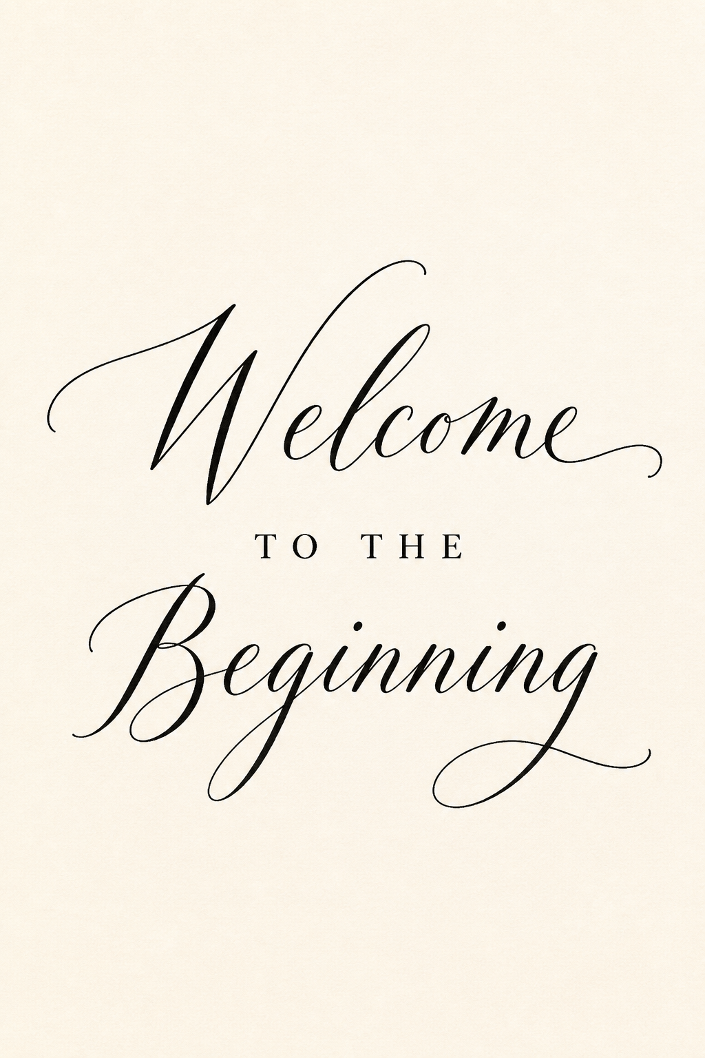
Wedding Welcome Sign: Letter "Welcome to the Beginning" exactly, with Welcome in airy pointed-pen script and supporting words in spaced small capitals, black ink on warm white, restrained entry and exit swashes, vertical sign with wide margins, no flowers or extra names.
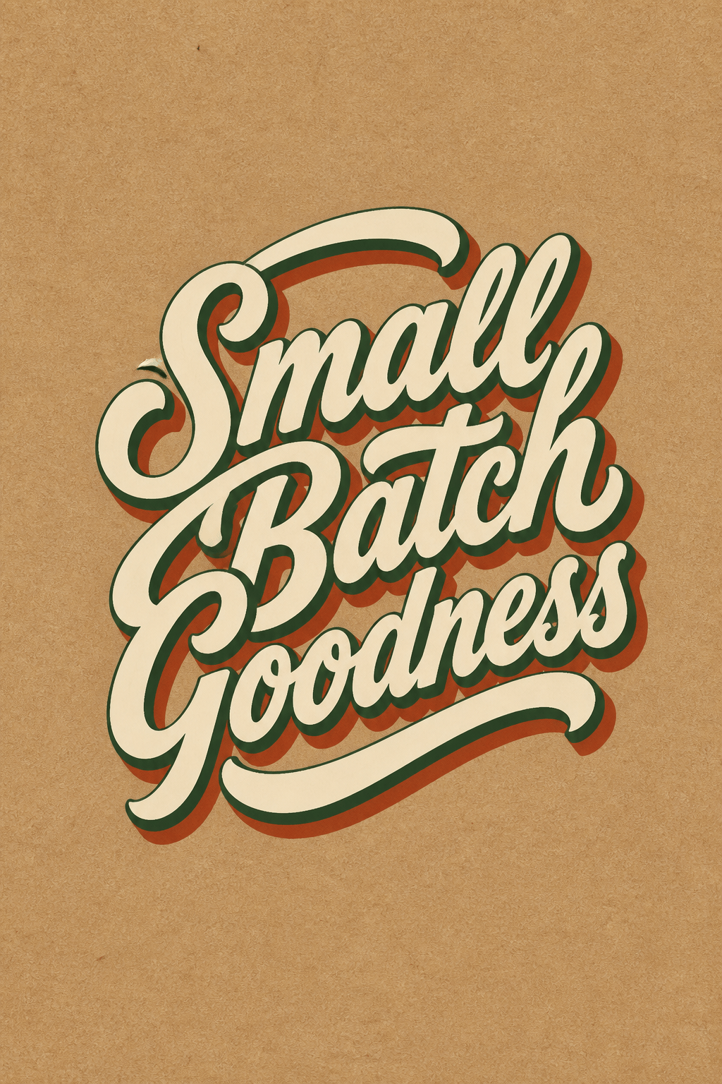
Retro Package Phrase: Draw "Small Batch Goodness" in bold 1950s sign-painter script, cream letters with dark green inline and rust shadow, compact oval composition for a jam label, confident brush terminals, no fruit icon, brand name, or mockup.
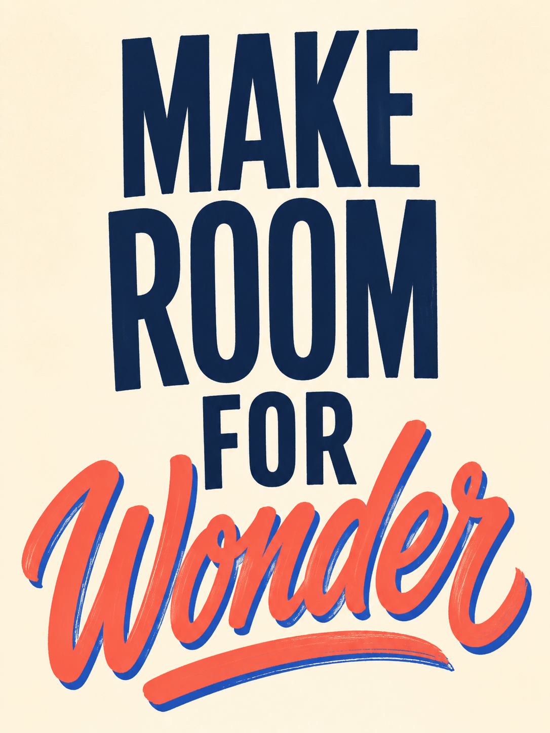
Motivational Poster: Hand-letter "Make Room for Wonder" on four lines, Make Room in condensed block capitals and Wonder in energetic coral brush script, cobalt shadow, playful but readable bounce, 3:4 poster, no stars, illustrations, or extra quote marks.
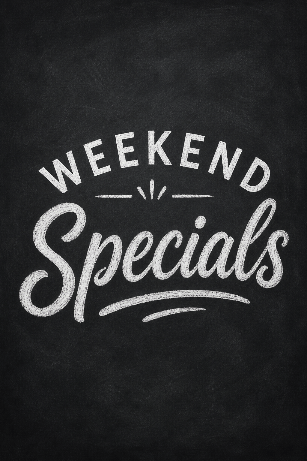
Chalk Menu Header: Write "Weekend Specials" in white chalk lettering, Specials as a friendly thick script with subtle dust texture, Weekend in arched sans capitals, dark slate board, simple divider strokes, wide menu header, no prices or food drawings.
Outdoor Brand Patch: Create "Wander Kindly" as rugged monoline hand lettering with slightly uneven carved edges, simple two-line badge composition, cream on forest green, thick enough for embroidery, no mountain icon, border text, or distressed mockup.
Sketch Refinement: Refine my permitted pencil phrase sketch into clean black brush lettering while preserving its original letter proportions and line breaks; smooth curves, consistent pressure contrast, repaired spacing, plain white background, no redesign, ornament, or extra text.