Free OnlineAI Graph Generator
How to Create a Graph with AI
Define the Question and Source
Request the Right Graph
Verify and Clarify the Story
Export With the Right Context
Why Mew Design Works as an AI Graph Maker
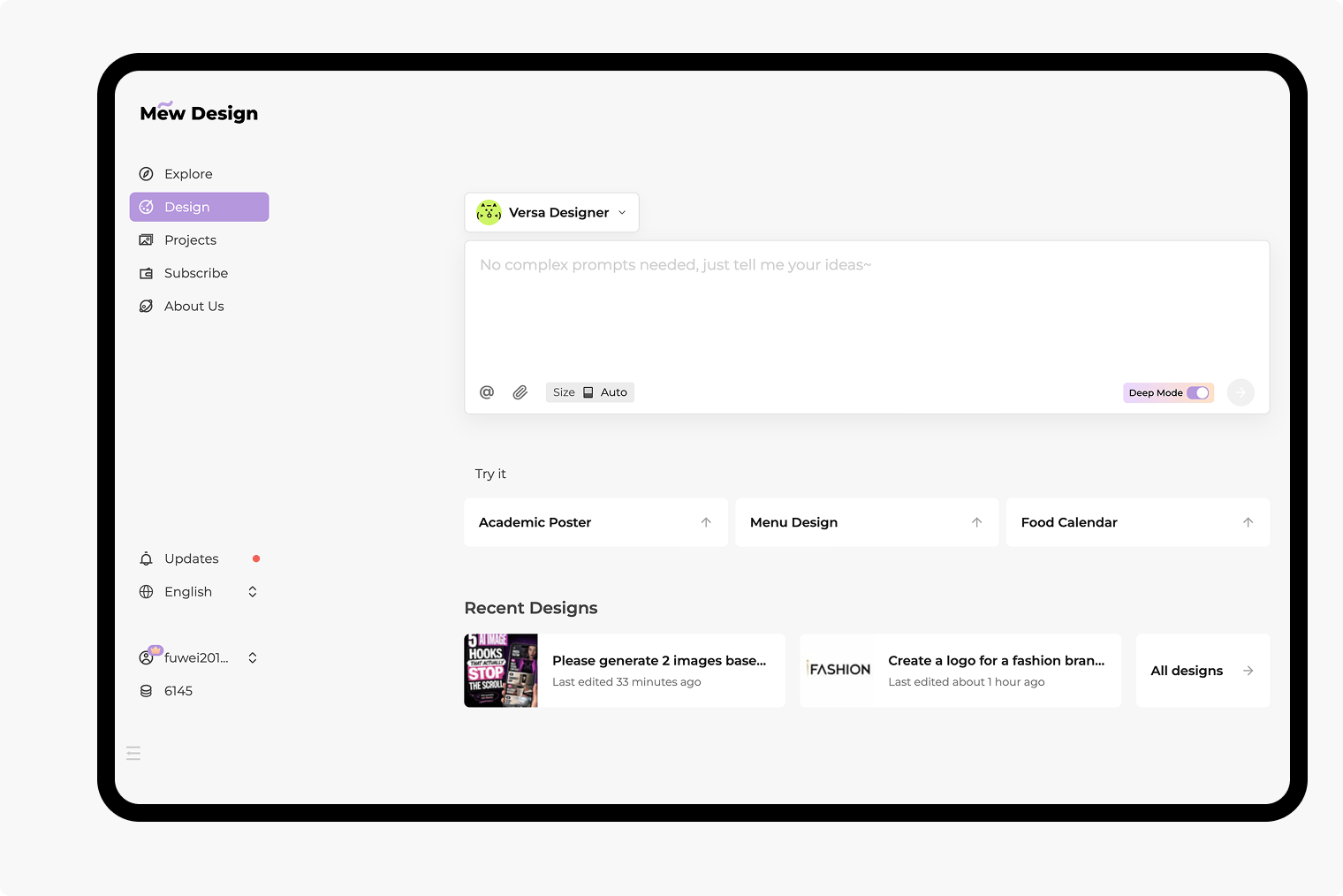
Create From Files, Not Just Pasted Data
Upload CSV, XLSX, PDF, DOCX, PPTX, text, or Markdown files to the dedicated library, reference a source with @, and ask Mew to use specific columns or findings. Up to three related documents can be referenced in one message.
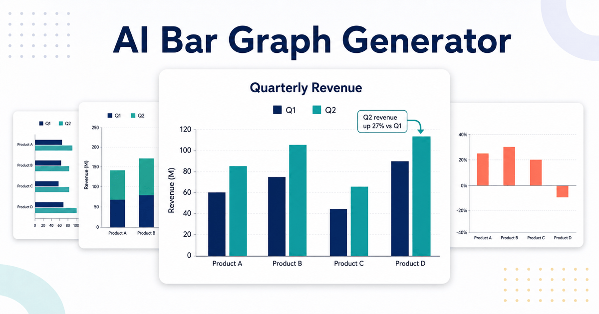
Match the Graph to the Question
Describe the insight you need to communicate. This AI chart generator can help frame a line graph for change over time, a scatter plot for relationships, a donut chart for a simple whole, or a heatmap for dense patterns.
Turn Analysis Into a Finished Visual
Go beyond a default spreadsheet chart. Ask for a headline, annotation, source note, brand palette, logo placement, and layout that fits an executive slide, research report, lesson, article, or campaign asset.
Refine the Data Story Through Chat
Use Chat Edit to switch chart types, rename axes, fix a label, change a unit, reorder a legend, reduce visual noise, or highlight one meaningful series without rebuilding the entire design.
Design for Readability and Access
The online graph maker can use restrained color, strong text contrast, direct labels, and a short takeaway when you request them. Always review the final visual and provide a text summary when accessibility matters.
Try, Refine, and Export Without a Watermark
Start the free AI graph generator with signup credits, explore a chart direction, and export the finished design without a watermark as PNG, JPG, or PDF. Usage depends on the credits available in your account.
How to Prompt AI for a Clear Data Graph
- Lead With the Question: Say whether readers should compare categories, follow a trend, understand a share, inspect a distribution, or test a relationship. The goal helps determine the graph type.
- Name the Data Precisely: Identify columns, filters, aggregation, units, time period, and the referenced file. Explain how blanks, totals, or outliers should be handled instead of leaving them ambiguous.
- Control the Reading Experience: Request a factual headline, direct labels, restrained color, accessible contrast, an annotation for the key point, and a source note. Avoid decorative effects that obscure the values.
- Review Before Publishing: Check every value, calculation, label, unit, date, axis, legend, and claim. This is essential for financial, scientific, medical, legal, and public-facing material.
Graph Prompts for Different Data Questions
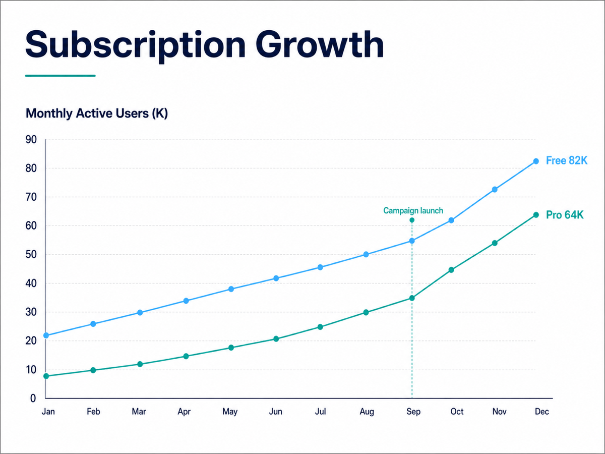
Trend Over Time: Use @subscriptions.csv to create a 16:9 line graph comparing monthly active users for Free and Pro plans from January to December. Label the final values, annotate the September campaign launch, use navy and teal, and verify every point against the file.
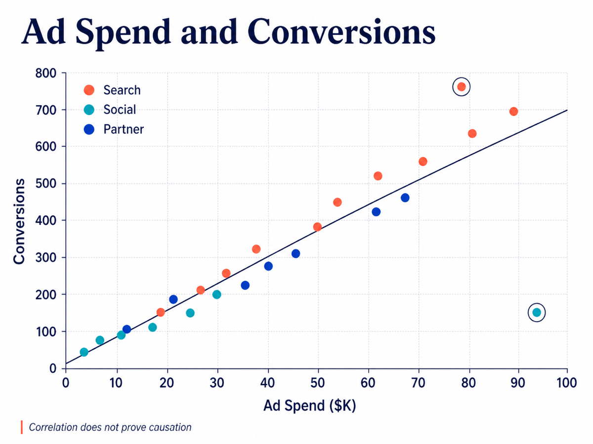
Relationship and Outliers: Create a scatter plot from @campaign-performance.xlsx with ad spend on the x-axis and conversions on the y-axis. Color points by channel, add a clearly labeled trend line, identify two major outliers, and format it for a marketing review slide without implying causation.
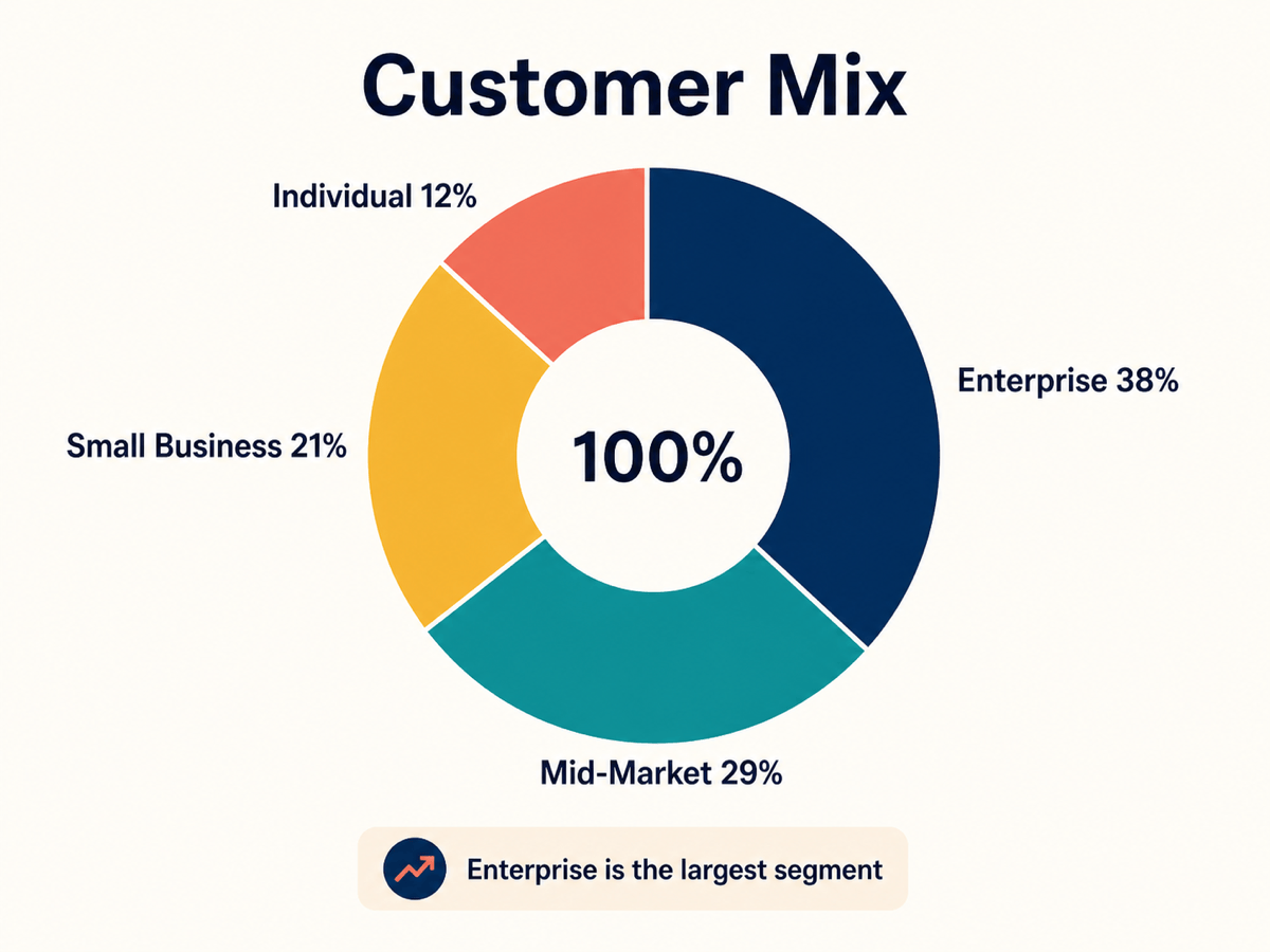
Part-to-Whole: Make a clean donut chart for a customer report using these segment shares: Enterprise 38%, Mid-Market 29%, Small Business 21%, Individual 12%. Use four accessible colors, direct labels, a centered total of 100%, and a short factual title.
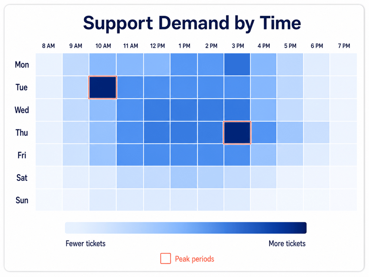
Dense Pattern: Use @support-volume.csv to create a heatmap of ticket volume by weekday and hour. Use a light-to-dark sequential scale, label the axes clearly, annotate the two busiest periods, and include a legend with exact ticket ranges for an operations report.
Classroom Data: Create a simple line-and-dot graph showing weekly seedling height for three plant groups over six weeks. Use centimeters, direct labels instead of a separate legend, a white background, large readable type, and space for students to write one observation below the chart.
Multi-Source Report: Reference @survey.pdf and @regional-results.xlsx to design one landscape data graphic showing the national satisfaction trend as a line graph and regional results as a small heatmap. Add separate source notes, use the same category colors across both views, and verify all extracted values and units.