Prompt
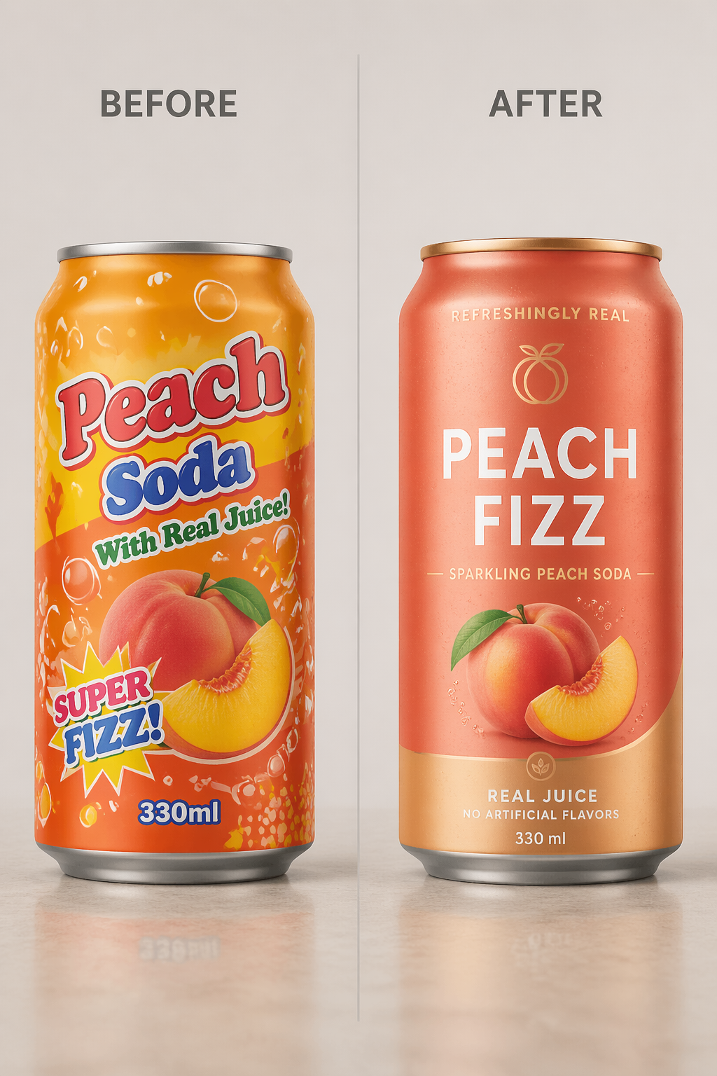
Create a realistic studio packaging redesign comparison for a canned peach soda. Show two cans side by side with labels BEFORE and AFTER. The before can should look cheap and cluttered, with bright orange graphics, bubble patterns, cartoon typography, and weak hierarchy. The after can should read PEACH FIZZ and feel premium, with a matte peach color, minimal logo, clean sans-serif typography, realistic peach fruit illustration, metallic gold base, and shelf-ready beverage branding. Use consistent soft studio lighting and a neutral surface.